As a final project for Visual Design Lab 5, I was given the opportunity to redesign a book cover of my choice. I selected The Knight and the Moth by Rachel Gilling because, as I developed my thumbnail concepts, I became increasingly inspired by the visual possibilities of this genre and excited to explore a new direction through my redesign.
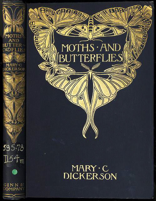
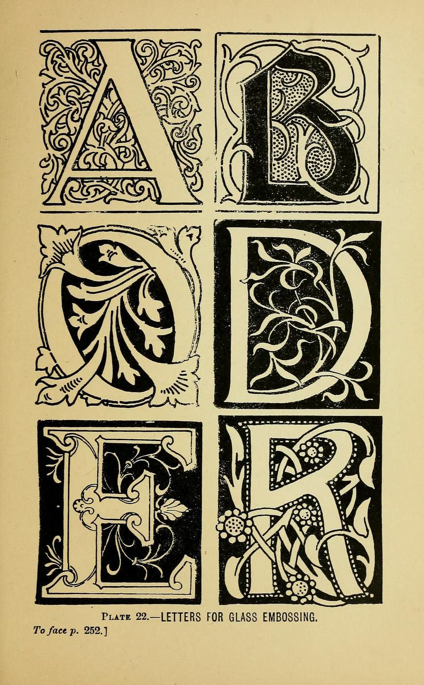
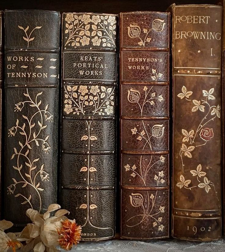
This beautifully written book draws deeply from the medieval world—filled with knights, magic, and rich gothic architecture. As I reimagined the cover, I wanted to create something that felt like a tribute to old medieval manuscripts. I leaned into delicate, intricate line work to capture that sense of history and craftsmanship, and to reflect the enchanting atmosphere of the story.
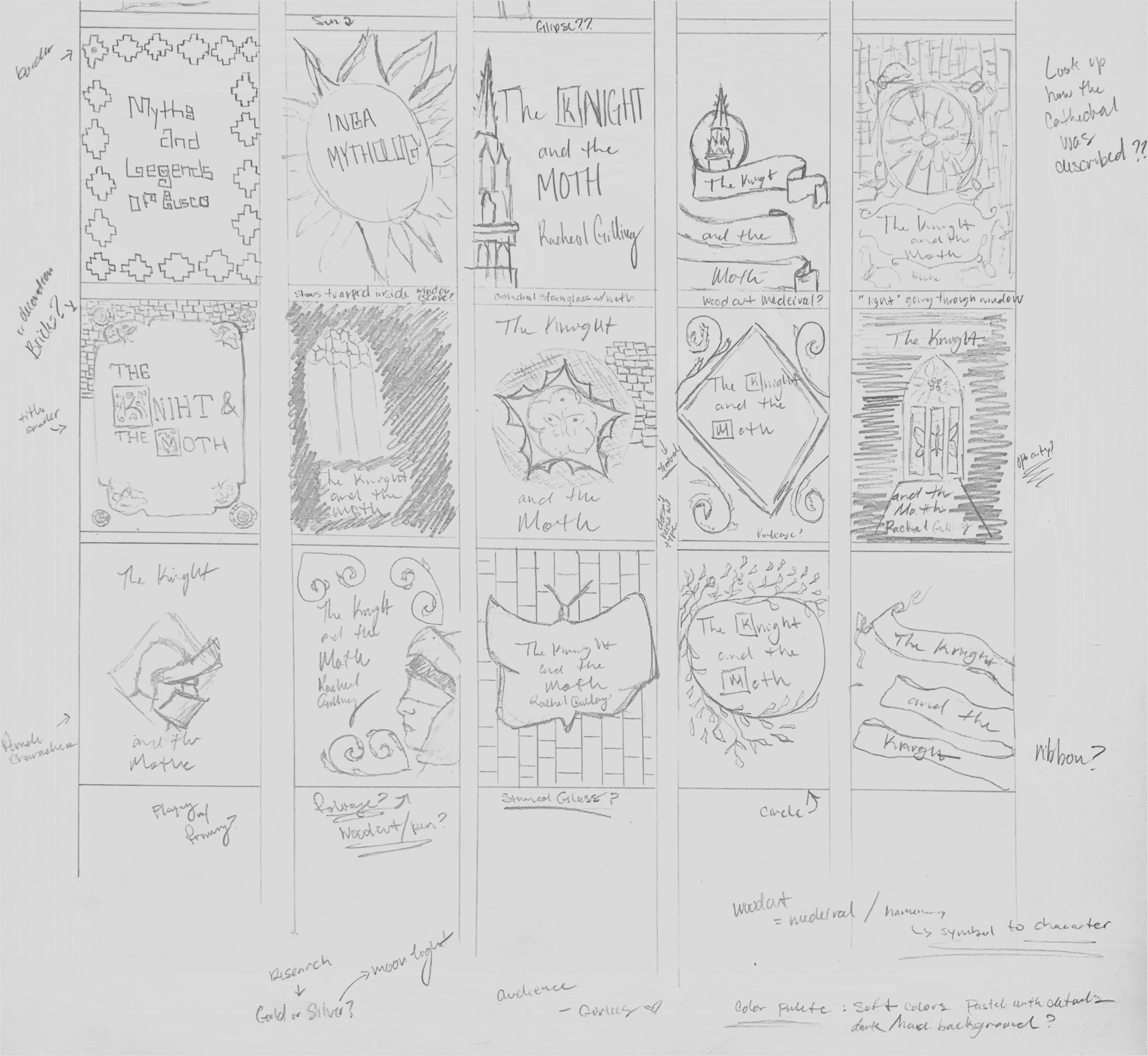
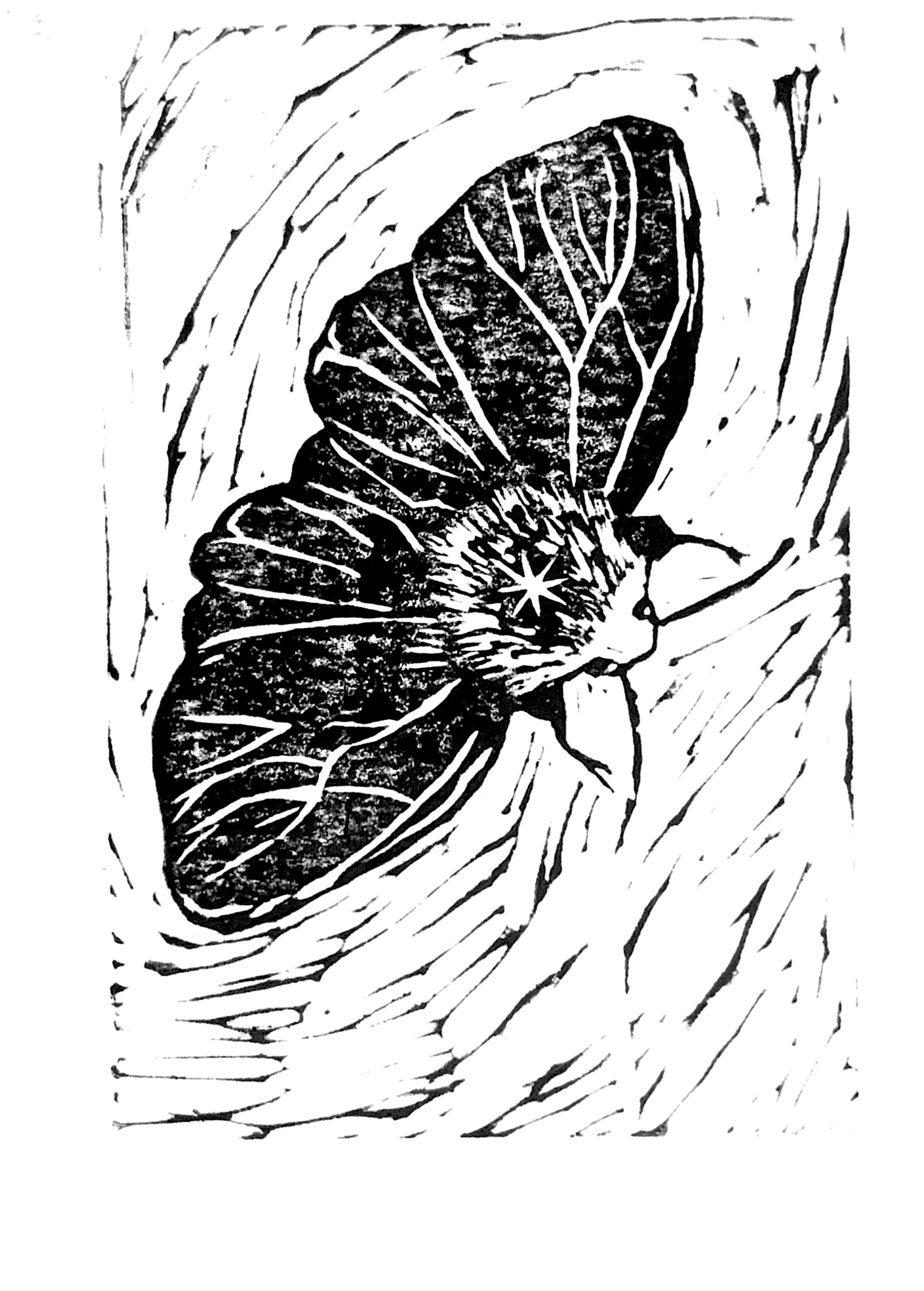
As I worked through my sketches, I initially explored using linocut techniques to bring in a textured, rustic quality that felt true to medieval aesthetics. However, I ultimately decided not to move forward with that direction—the look felt a bit too rough and graphic for a romantasy novel, and didn’t align with what readers typically associate with the genre.
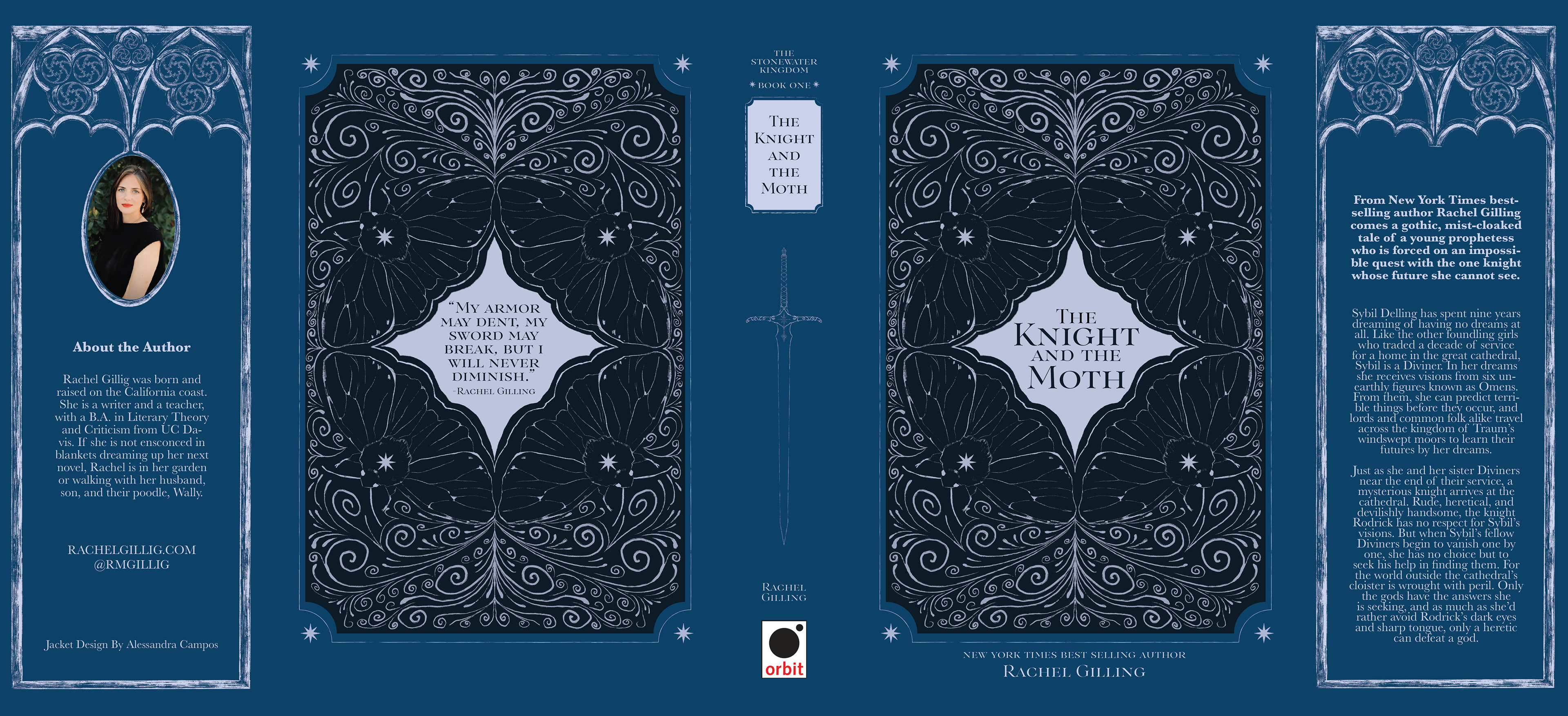
In the end, I developed two visual directions: one minimal and one more decorative. Both centered around subtle symbolic elements from the book. Instead of thick linocut strokes, I used fine, textured lines that maintained a strong medieval presence but with a lighter, more elegant touch—reflecting the nuanced strength of the main character.
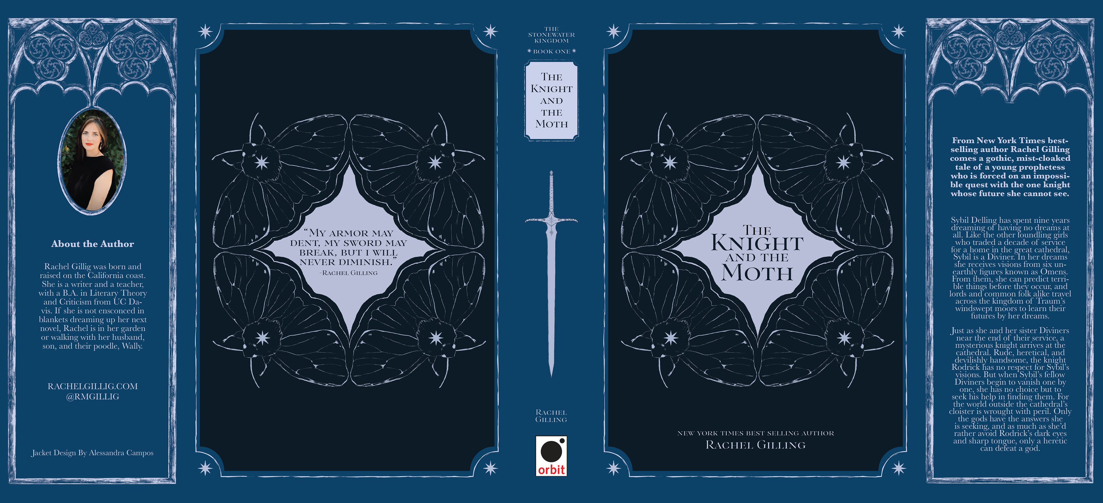
In the decorative version, I incorporated swirling line motifs designed to be open to interpretation. They can suggest the etched patterns found on a knight’s armor or represent the nonlinear journeys of the characters, each following their own path.
Ultimately, the refined linework direction allowed me to balance historical influence with genre expectations, creating a cover that feels both rooted in medieval aesthetics and visually aligned with contemporary romantasy design.